
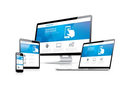
Responsive Website Design
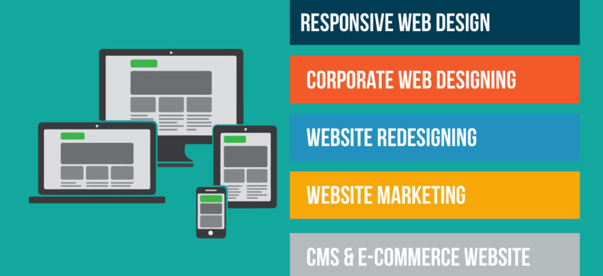
Responsive web design is a method of developing your website so that it automatically adjusts to the screen size and device used to view the site. This ensures a consistent user experience and allows you to replicate your site’s content without reducing it for smaller screens, as you need to do with a mobile site. Every site that Kreative Online Designs builds is built using responsive design, giving our clients an optimal viewing experience—easy reading and navigation with a minimum of resizing and scrolling—across a wide range of devices (from desktop computer monitors to mobile phones).
A responsive website is more than your logo and contact details. Your website speaks to your customers, it tells them your story, your ethics and most importantly what makes you the best. Your website is the first point of contact for many of your clients – make your first impression a good one. Through a series of in-depth discussions and research into your area of expertise, our consultants want to know your business as well as you do. The result? Your ideal website, showing your customers why your company is better than the rest.
Some benefits of having a Responsive Website
- Your site scales to desktops, notebooks, tablets and smartphones now and in the future
- One site for all devices consolidates web traffic for better SEO results.
- Provide broader content on your mobile properties
- Managing one site and one SEO campaign is far easier than managing two sites and two SEO campaigns
- Staying ahead of competition